Design Systems
Digital product design and development at scale.
Client
The Church of Jesus Christ of Latter-day Saints
Services
Design Systems
Creative Direction
Art Direction
Design Leadership
Technical Integration
Mentorship
AI Enablement


The Value of a Digital Product Design System
A digital product design system is a unified library of reusable components, design guidelines, and code documentation that gives product teams one shared foundation to stay aligned. For The Church of Jesus Christ of Latter-day Saints, whose digital tools serve a global audience in worship, service, and learning, that foundation matters deeply. A well-built design system ensures every experience feels consistent, cohesive, and trustworthy, allowing teams to scale quickly without sacrificing the care, quality, and identity that reflects the Church’s values.
Unified Experience
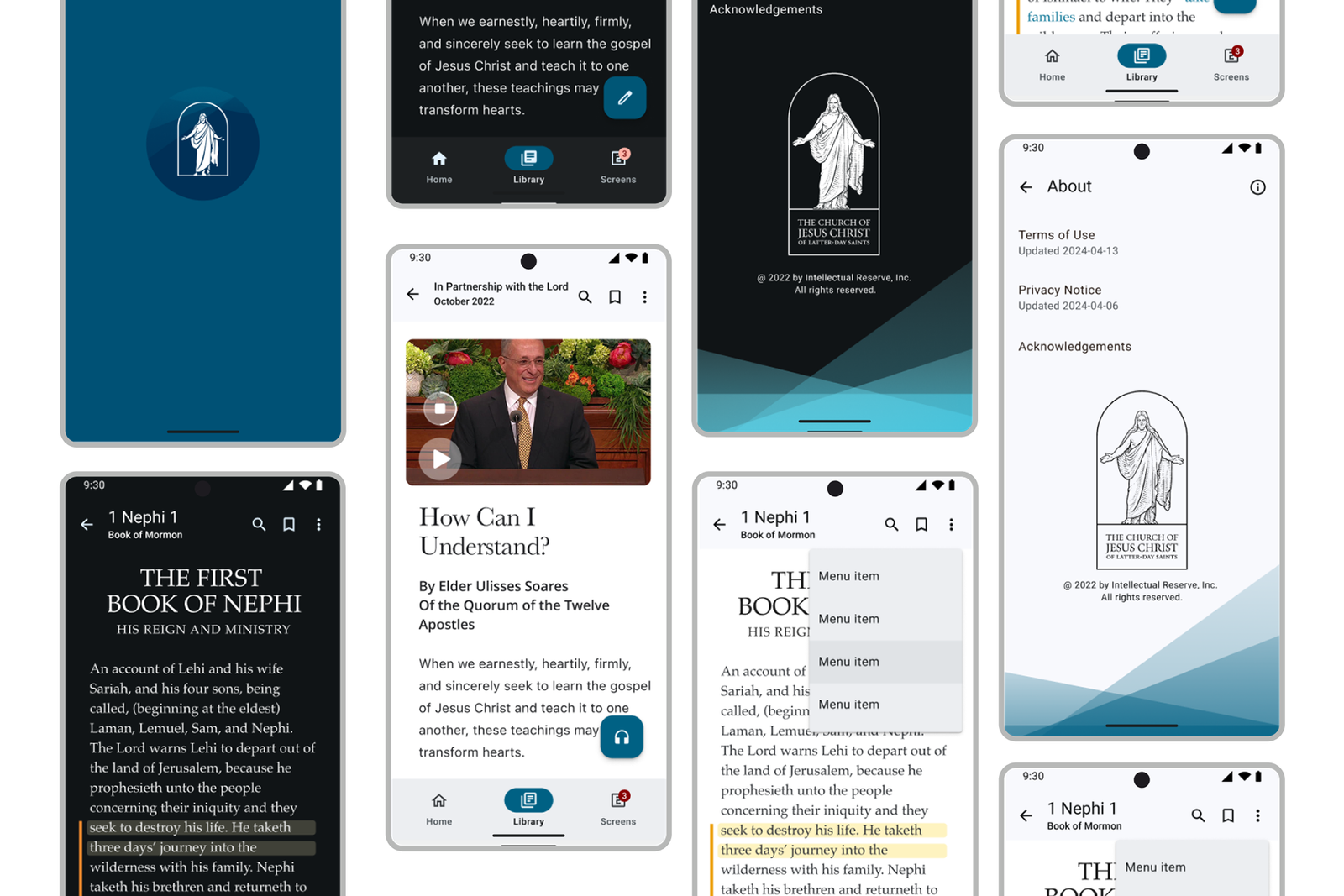
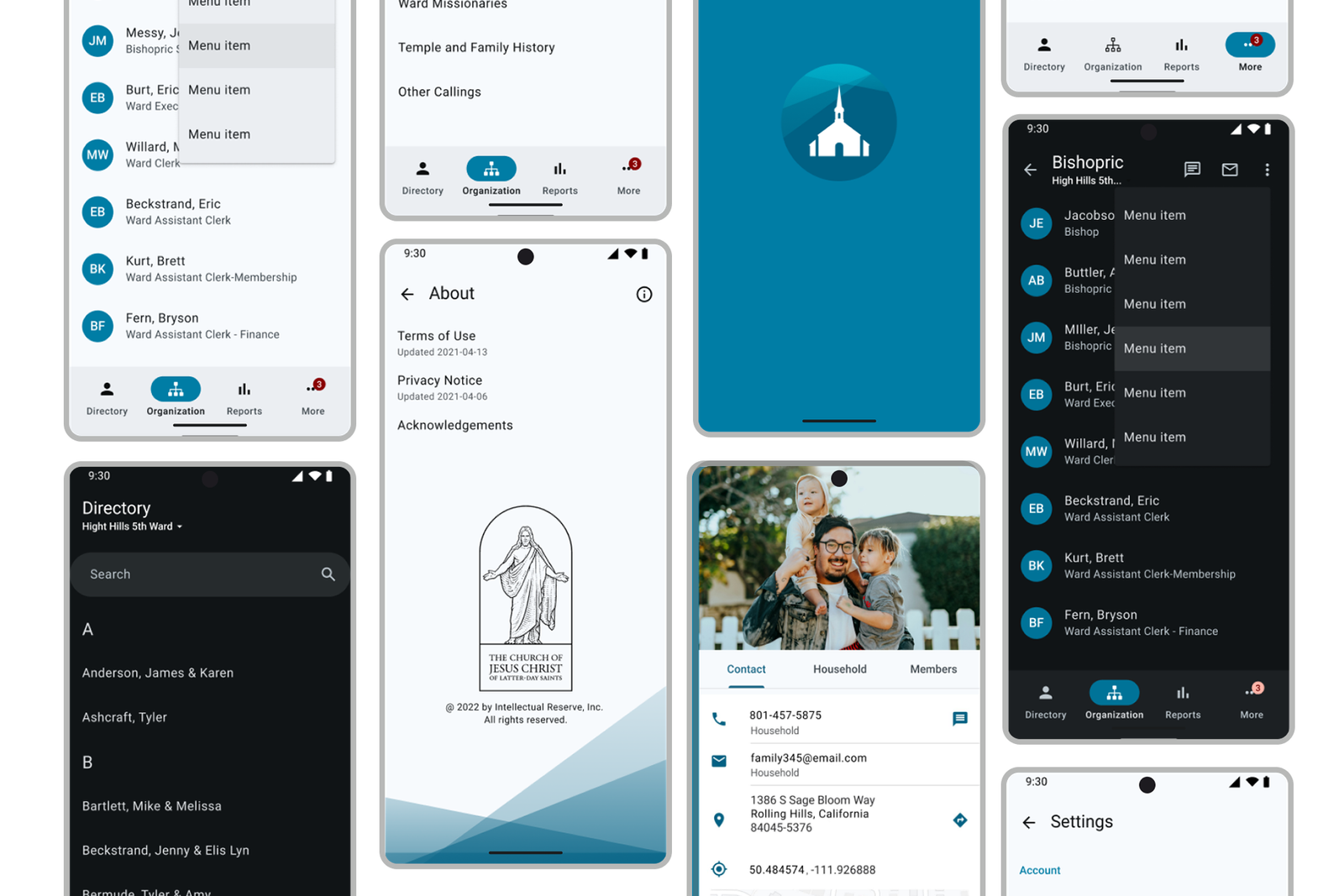
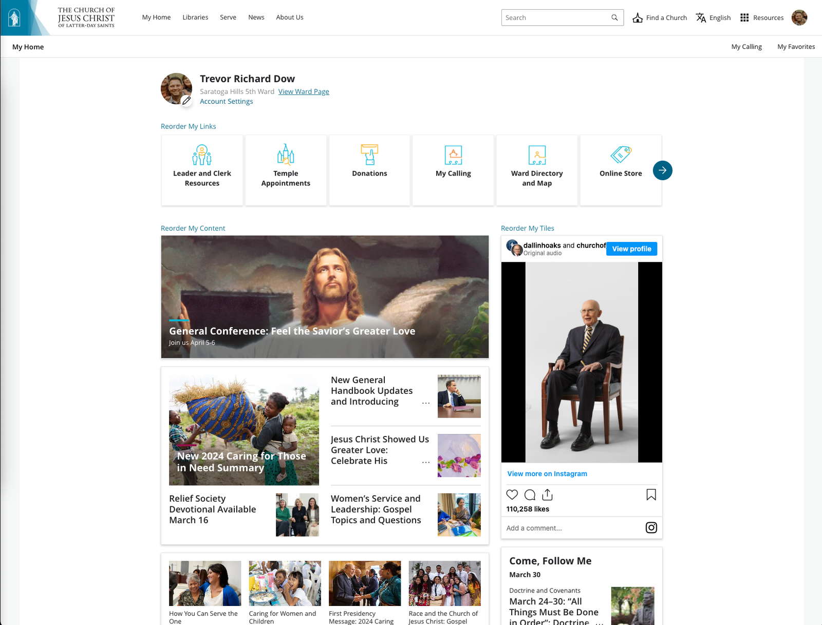
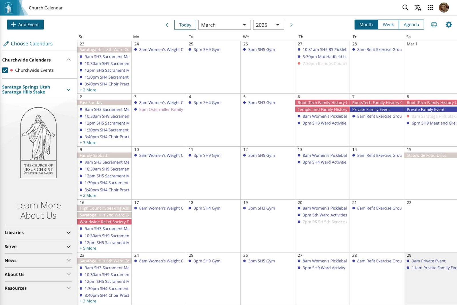
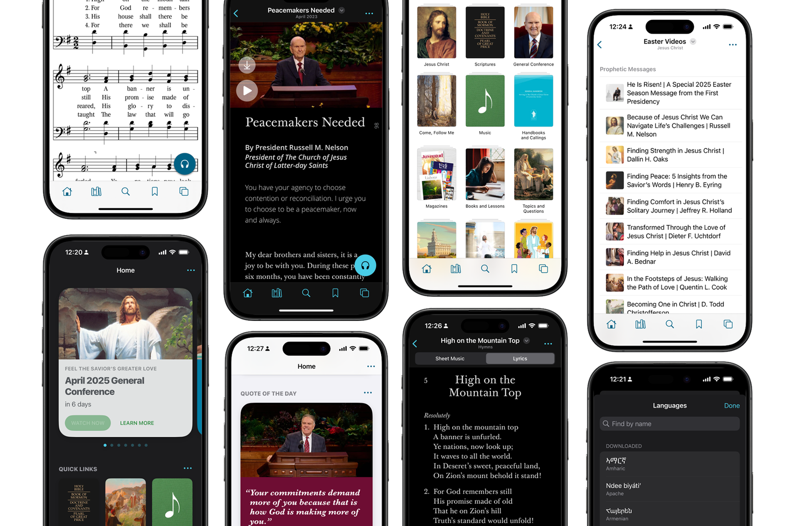
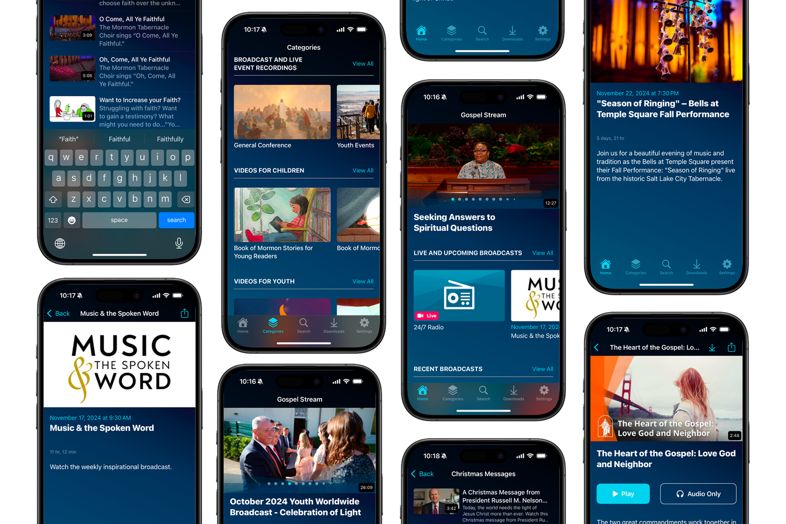
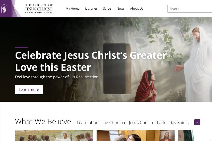
A design system ensures that Church products like the Gospel Library App and ChurchofJesusChrist.org look and behave consistently, no matter the platform. Individuals moving between tools encounter the same visual language and interaction patterns, creating a seamless and familiar experience.
Scalable Design and Development
With many contributors and a rapidly growing set of digital tools, a design system helps product teams move faster without sacrificing consistency. Shared components and guidelines mean less time rebuilding the same solutions, and more time focused on meaningful work. A design system also gives AI agents a clear framework to work within, ensuring that anything they help design or build aligns with your established standards.
Built-in Code and Documentation
The Church's design system includes ready-to-use, accessible code for UI components, paired with clear documentation that helps teams implement it quickly and correctly. This foundation spans every major platform — Web, iOS, Android, OTT (streaming devices), and Wearable Tech — so teams build once and deploy everywhere with confidence.
Cost Efficiency
A design system reduces duplicated effort and shortens development timelines, freeing teams from rebuilding what already exists. Fewer inconsistencies, fewer bugs, and more energy spent on work that actually moves the product forward.
Consistent User Experiences
Thoughtful, consistent design builds trust and enhances usability — two things that matter deeply when digital tools support someone's worship, learning, or service. A design system helps ensure every interaction feels simple, beautiful, cohesive and intuitive.
Scalability
A design system built on atomic design principles starts with the smallest building blocks like colors, typography, and buttons, then assembles them into larger, more complex components. This means a single update ripples consistently across every product and platform, making large-scale changes fast and effective without introducing inconsistencies.

By small and simple things are great things brought to pass.
Components
• 13K Components across Web, iOS, Android, Mobile
• 11K Inserts Per Week
Cost Savings
$1 Million Year-over-Year cost savings
Impact
• Supports 150 Digital Product Teams
• Translated into 115 languages
• Products distributed Worldwide
Outcome
• Cohesive Look and Feel for all digital products
• WCAG 2.2 Accessibility Standards.
• Centralized access to components for fast effective system wide updates.
• AI Agent Enablement
A design system has helped The Church of Jesus Christ of Latter-day Saints build faster, reduce duplicated work, and maintain a unified experience across its websites, mobile apps, and digital tools. Teams work from a centralized library of reusable components and shared principles, freeing them to focus on meaningful work rather than solving the same problems twice. The result is a digital presence that feels consistent and trustworthy to members and visitors everywhere, one that reflects the Church’s values, protects the integrity of its brand, and ensures a cohesive identity no matter the platform or audience.

Building a Unified Digital Experience Through Atomic Design
The Church’s design system was built using atomic design principles, starting with the smallest foundational elements like colors, typography, and buttons, then combining them into progressively more complex components such as forms, cards, and full page layouts. This modular approach gives designers and developers a shared building language, making it easier to create interfaces that are consistent, scalable, and straightforward to maintain across diverse digital products. Because everything connects back to those foundational elements, a single update automatically carries through the entire system, keeping every product aligned and reducing the coordination burden across teams.
GVSG Blue 10
#e83b26
GVSG Green 10
#1c5a3e
GVSG Yellow 10
#1d51a7
GVSG Red 10
#eda032
GVSG Blue 10
#e83b26
GVSG Green 10
#1c5a3e
GVSG Yellow 10
#1d51a7
GVSG Red 10
#eda032
Cascading Design Elements
CSS works by flowing styles from general to specific, with broad foundational rules that more targeted rules can refine or override. We applied this same logic to build what we call a “Cascading Design System”, or CDS.
Just as a change to a base CSS rule updates every element that inherits from it, a change to a foundational element in the CDS, like a color variable or button style, automatically carries through every component and page built on top of it. This means system-wide updates can be made by changing a single element at the right tier, rather than hunting down and updating every instance manually. The result is a system that is faster to maintain, easier to scale, creates a cohesive visual identity, and is adaptable and flexable for any digital platform you seek to support.

Bringing atomic design principles and CSS cascading together creates a powerful foundation for building digital products at the scale a global organization like The Church of Jesus Christ of Latter-day Saints requires. Atomic design ensures each component is thoughtfully crafted and reusable, while CSS cascading allows those components to adapt naturally across different contexts, platforms, and screen sizes. Together they form a system where updates to core styles or components carry through every digital experience consistently, preserving brand integrity without requiring teams to rebuild from scratch. This makes it possible to localize content, meet diverse accessibility needs, and respect regional differences, all without fragmenting the design system or losing the cohesive, intentional identity the Church’s digital presence is built on.
Results
The Church of Jesus Christ of Latter-day Saints design system has delivered measurable results at every level of the organization. Updates to trademark assets, colors, typography, spacing, or UI elements can now be made in one place and reflected instantly across thousands of web pages and 26 mobile applications spanning iOS, Android, OTT, and other platforms.
What previously required months of manual coordination across disparate teams can now be executed in minutes, with precision and consistency. These efficiency gains have translated directly to the bottom line, saving the Church over one million dollars in year-over-year overhead costs, while freeing teams to focus on innovation and respond to user needs more effectively. The design system also provides a strong foundation for working with AI and AI agents, giving them a clear framework of standards and components to work within, positioning the Church to move confidently and effectively into the AI era.
The design system now serves as the foundation for every digital product the Church produces, maintaining a unified brand experience across thousands of webpages, multiple web applications, and a growing suite of mobile apps worldwide.