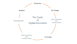
Discovery
I am a problem-solver. My first priority when looking for solutions is to fully understand the problem. As Albert Einstein said, “If I had an hour to solve a problem, I’d spend 55 minutes thinking about the problem and 5 minutes thinking about the solution.”
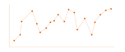
In this “Discovery” phase, my goal is to look at as many data sources as possible, both quantitative and qualitative research. This is crucial to fully understand what is going on. A number of tools are utilized in this process including, but not limited to Digital Analytics, user research, review of error logs and messages, bug reports, and observing actual user behavior with the existing digital experience (if one currently exists). During this phase, I can uncover common patterns and themes. Performing a usability test can confirm these findings.
UX Design
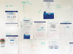
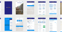
Once a problem or opportunity for improvement has been identified, I can distill the problem down to a core functionality to improve upon. If it comes down to user flow, I create a bird’s eye view by printing the entire flow and taking a step back to observe how it’s currently experienced. This allows me to view the experience in its entirety and immediately begin to visualize a plan to take the end-user from Point A to Point B. Available technologies are also identified that may help to improve or streamline that journey. Numerous questions are considered during this design process:
• Is there a way to reduce the steps the user must take?
• What is the obvious “Easy Path?”
• How can I make this experience easier for the user?
• What are the business objectives?
• What are the visitors/customers’ objectives?
• What will our main Key Performance Indicators (KPI) be?
• What is our definition of “success”?
• What is the fail state, and what does that experience look like?
As you can see, there is a lot of consideration in this phase of the creative process. By taking the time to answer these questions, we ensure our focus remains on solving the problem and improving the user’s experience.
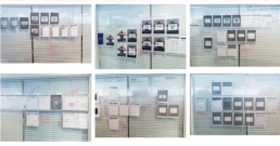
My current team at 1-800Contacts has a weekly design sprint. For one week we use the creative process to improve or create new digital experiences. Each week we take our ideas and UX design concepts and present them in a fun, collaborative, cross-functional design critique that I have created and coined as our “Bob Ross Meetings.” During this meeting, the designer posts their week’s work on the wall and team members have an opportunity to critique or add to the idea. At this point, the idea concept is typically in the gray box concept as we focus on getting the interaction and user flow polished.
Rapid Prototyping and Usability Testing
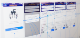
After iterating and refining the ideas and getting internal feedback, the next step is to get real user feedback. To accomplish this, a quick initial prototype is built and presented to a focused group of users to collect their perspectives. This is the most critical step in the process. I have utilized many tools to execute this: HTML/CSS/Javascript, Adobe Flash, AfterEffects, InVision, Adobe XD, Principle, and Figma. Ideas should be tested and refined as quickly as possible. This will validate the design concept and determine whether it will be a solution to the problem we have set out to solve.
UI Design and Animation
The next step is to apply the final look and feel to the design. While this step is often mistakenly assumed to be the role of a digital designer, it is only a small fraction of the process! Only after the user experience has been successfully designed should you work on the final graphics.
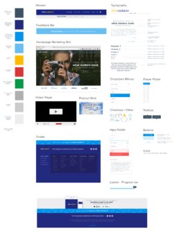
At 1-800Contacts, we had a goal to improve the consistency of our various digital platforms. A design system was created to ensure this consistency between internal design teams, outside creative agencies, and development teams.
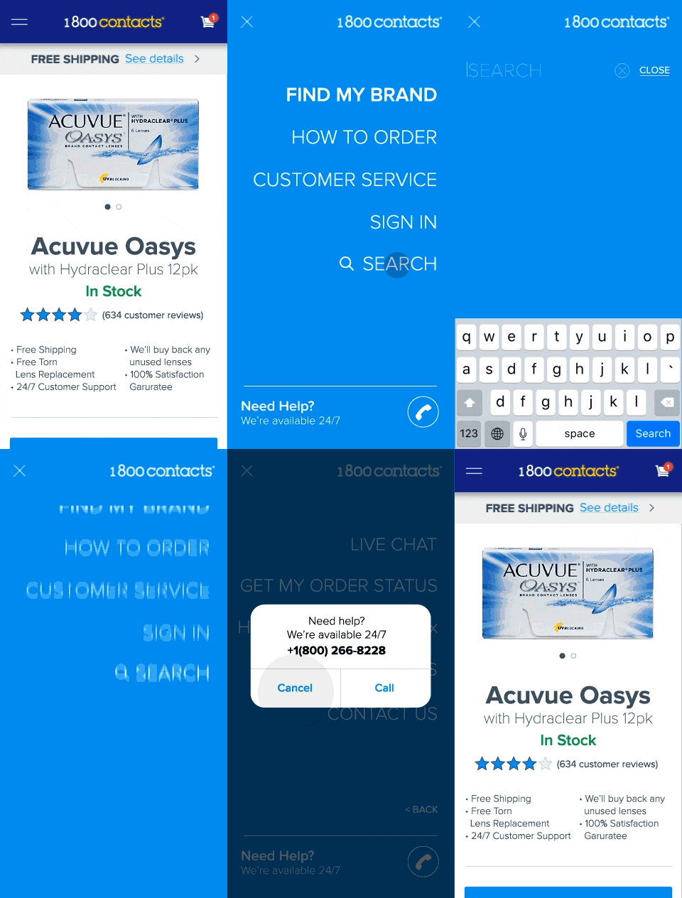
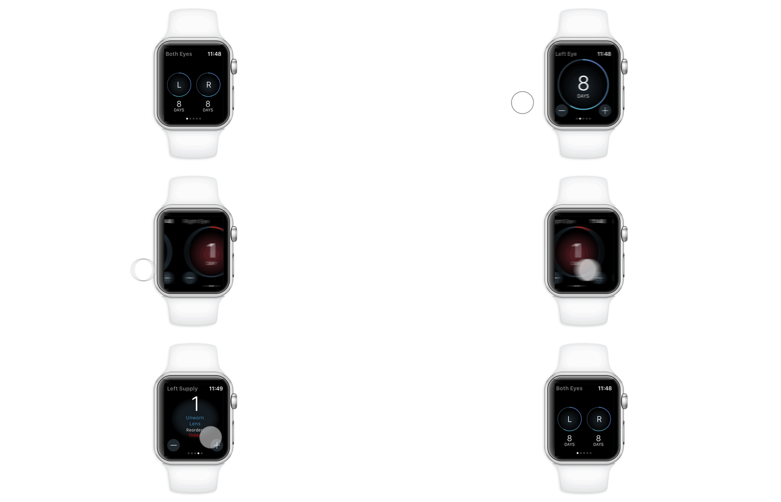
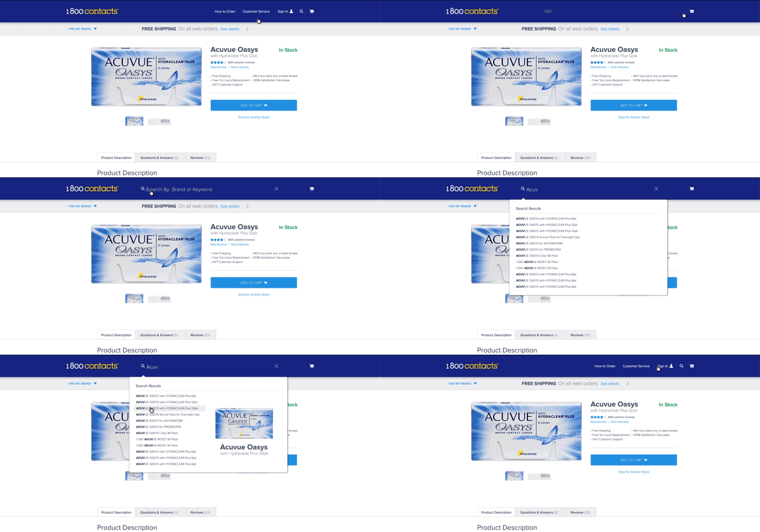
To further enhance the digital experience, animation can be added. It is the polish that will attract the user’s eye and direct their attention. Animation is a powerful and useful element if it is done correctly. It must be timed well, follow the laws of physics, and be unobtrusive and explicit.
Like a soundtrack to a movie, if done right, animation can enhance the overall experience. If done poorly, it will distract and dilute the emotional connection.
Development
The development process is another crucial step. Without a strong development team, a design will remain just that…a design. To have the most successful end product, a developer should be just as passionate about maintaining the elements of design and animation as the designers themselves. While they may not design these visuals and experiences, they do need to be just as passionate about producing them. When designers and developers sit together through the development process, magic happens! Maintaining pixel perfect design details throughout the development process will set the final experience apart from the rest.
Release and A/B Testing
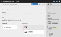
It’s now time to release the experience. There are a number of tools available to ensure a controlled release allowing you to release the new digital experience out to a small selective group to ensure positive results will follow. I have experience with both SiteSpect and the Adobe Target testing platforms.
Analyze and Repeat The Process
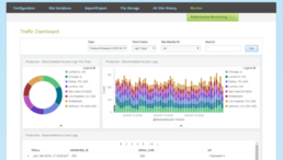
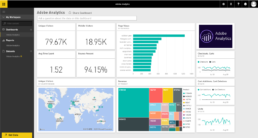
The data will now be pouring in, showing the impact of the improved experience. Once you have identified your winning results, you can increase visitor traffic and release the full digital experience to the rest of your audience. With this new baseline, you can rinse and repeat and begin the process again.
Summary:
I use data to identify opportunities, the creative process to solve problems, and technology to deliver it.

