
About The Project
For over 20 years, 1-800 Contacts has prided itself in providing its customers with the easiest and fastest way to order contacts. In 2012, the company launched its first mobile application that focused on just that–streamlining the ordering process on a mobile device. With over 1 million app downloads and orders, the app had seen great success. The team wanted take the mobile app even further and expand it to be even more accessible and provide it’s digital purchasing process on all mobile devices (Tablets and Digital Watches) and update the look and feel to match the newly updated 1-800 CONTACTS website design.
Old Design
The original design of the mobile app (shown below) was in need of an update to reflect the new progressive branding the company had recently gone through. 1-800 Contacts was also in the process of updating the look and feel of their main e-commerce store front and the app needed to fit within it’s newly created visual style guide. The current design felt visually busy, and was visually lacking the core branding appeal.

UX Design
The mobile device provides many amazing technologies all at your fingertips. The ability to scan a barcode to quickly find your brand, the ability to use your camera to take a photo of your prescription and streamline the doctor entry process, and to avoid typing in your credit card number, using the geolocation feature to find your doctors office if needed and remembering your login in credentials for a seamless entry. All of these were considered when designing out the user experience for the new mobile app. The team was able to distill the ordering process down to a simple two tap reordering process for returning visitors.
UI Design
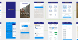
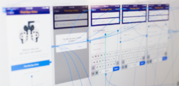
To ensure a consistent and cohesive look across the entire digital storefronts and to match the 1-800 CONTACTS e-commerce website redesign, a UI kit was established. These UI kits contain repeatable elements found within the app, color strategies for color theory, font types and sizes. These UI kits were instrumental for keeping our teams in sync across multiple platforms and allowed the teams to create concepts quickly; which was helpful during the rapid prototyping phase.

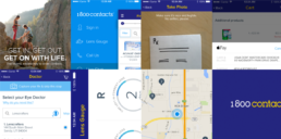
Once the visual style was established, we worked on updating the design throughout the app. Each screen was updated with this new visual look and feel as well as applying the UX updates. The screen addressed were: the homepage for new and returning customers, upload and skip feature for prescription entry, product listing page, product description pages, cart page, doctor search, account management and Rx wallet.
Bob Ross Review
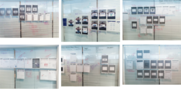
Each week the team met to review the most current design concepts and gather feedback from key stake holders and team members. Within these design critiques we post our work on the wall and observe how we are planning to take the customers through the experience. This allows us to observe the user experience from a birds eye view and see it as a holistic experience; allowing us to refine our ideas and look for usability pitfalls. Each section of the app goes through a two week design iteration.
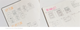
Prototyping and Usability Testing
After we have refined our ideas, we bring these concepts into a prototyping program (we’ve used many different programs to do this. InVision, paper, HTML, ect. The team at 1-800 Contacts is currently using Adobe XD). These prototypes allows us to move quickly and try out ideas in a rapid prototyping environment. The concepts are presented to small usability groups where the team can observe, iterate and refine the design.
Full Mobile Platform
One of the requirements for this project was to expand the original mobile app to other mobile platforms. The redesign included designing the full experience for tablet screens as well as for the Apple Watch and Android Watch. Trevor had the opportunity to work with Apple Inc. to test the new watch application prior to the Apple Watch launch in 2015. The UX design for the apple watch enables the end user to keep track of their lens usage with “lens gauge” and to reorder within two taps.

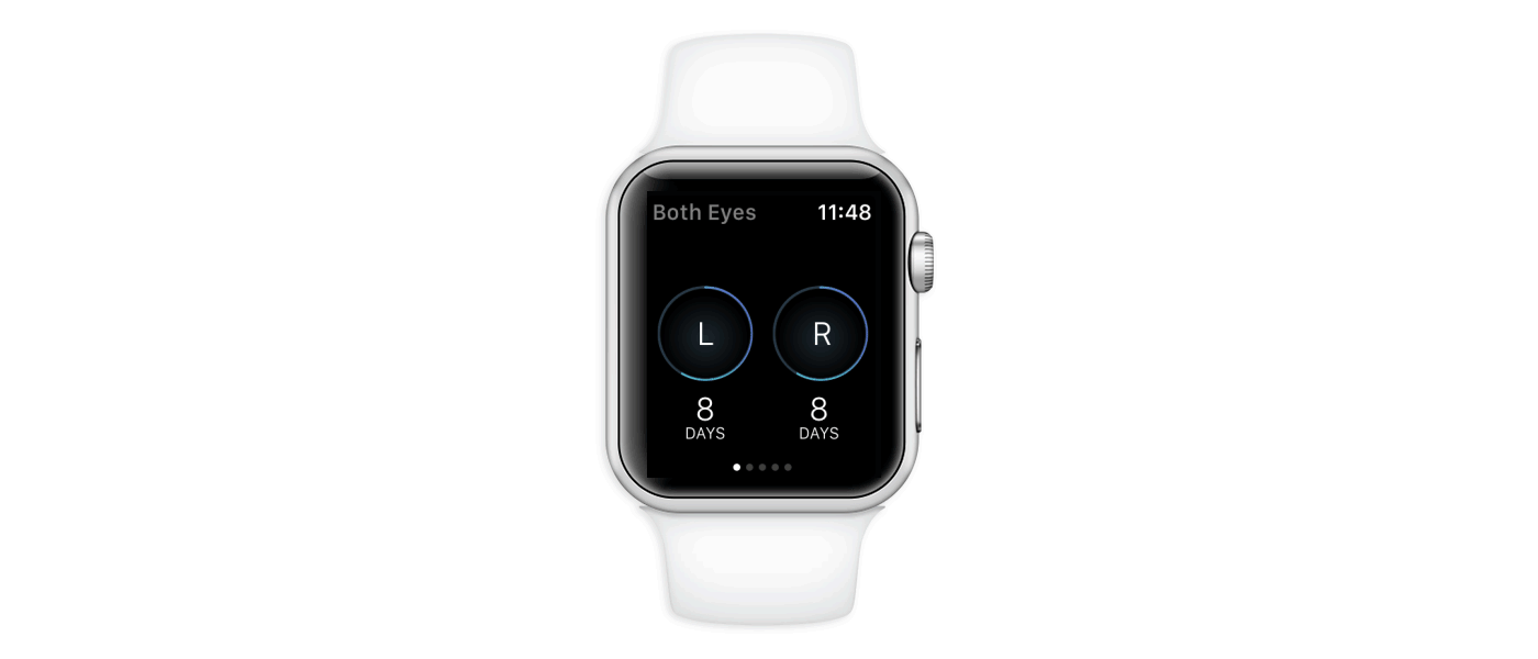
Apple Watch App – Lens Usage Gauge
TV commercials to promote the app
Several commercials were created to promote the 1-800 Contacts app, all focusing on how easy and fast it is to use.
Results:
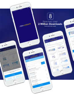
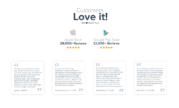
The app achieved over two million app downloads, a five star rating on the Apple app store (28,000+ reviews) and 4.9 rating on the google play store (22,000+ reviews). The customers are constantly raving about how easy and fast it is to order. The new app also saw a 6% overall growth, 4% conversion rate growth, 31% revenue growth and has been the main area of overall growth within the company.
1-800 Contacts Mobile Apps
The 1-800 CONTACTS app is the fastest, easiest, and most enjoyable way to order contact lenses.
Where else can you reorder your contacts in three taps? Only the 1-800 CONTACTS app. But what if you want to reorder in only two taps? Good news: Two-tap reordering from your Apple Watch.
Simply scan the lens box to upload your prescription or upload a picture of your paper Rx for faster shipping. Then use your camera phone to pay with your credit card, or use PayPal. Reorder from your secure account in three brief taps or select Auto-Reorder so you’ll never run out of contacts.
Client1-800 CONTACTS, INC.ServicesCreative Direction, UI / UX, EcommerceYear2015