
About the Project
I was recently asked… “if I could change the Spotify app, what would I change? How would I improve the design?” I love the free streaming music service and had been using the app for some time so the question didn’t take me by surprise. After tripping over the same usability problems over and over again, it got me thinking… “If I could change it, what would I do differently? I spend most of my time within the “Your Library” section, so I put my focus there. I decided to set out and redesign that section of the app.
Step 1: Discovery
The first step was to observe and interact with the current design. I asked myself “What was going well? What could be improved upon? What seemed cumbersome? What was getting in the way of achieving my desired outcome? What did Spotify want to achieve, from a business perspective?” I jotted down my thoughts and organized my ideas.
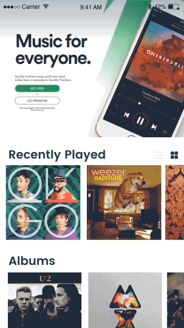
The Current Design:

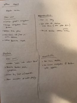

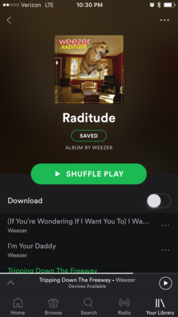
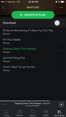
I discovered six areas that could be improved upon. They included: 1. I found the navigation to get to my saved list to be very cumbersome. 2. It was annoying that I could only shuffle play (of all the things to change… I was most passionate about this one! – I understood why that was there. They wanted to entice people to pay for the premium account so they could have a regular “play” button. I found this extremely annoying and I knew I could provide a better user centric solution and still meet the business revenue objectives – more on that described below). 3, There was no logical way to setup or control the playlist. 4. It was difficult to see what was next on the playlist. 5. The album art was very small. 6. It felt very unconventional to other music player apps.
Observe other industry leading apps.
I wanted to get a sense of other music players in the market and observe what interaction models may already exist. This would help identify what affordance end users would already be keen to and familiar with. I also wanted to observe current design trends.

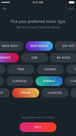


Here is what I found going through this process: 1. Use Large UI and graphical elements to help drive focus and design hierarchy. 2. Interaction models were focused on three points of engagement. 3. Bright, bold colors, 4. The use of Swipe navigation, 5. Large engaging visuals.
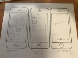
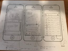
Step 2: Design wireframes and interaction models
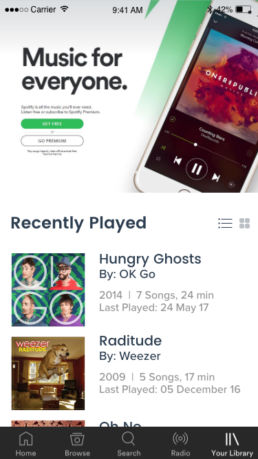
After observing what the current industry was doing and what opportunities I found from interacting with the current design. The next step was to get my ideas sketched out. I knew for the new design, I wanted to bring in new elements. Focusing on: a larger UI and graphical elements. To enlarged the album art. To use a standard play and next button interface. Provide a cleaner method to manage the playlist and even reorder if desired, the ability to quickly search your library and lastly, bring the advertisement into the app and not rely on shuffle play.
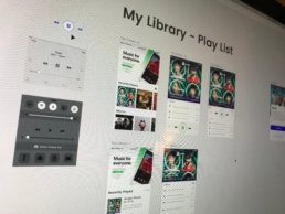
Step 3: Design High Fidelity Concepts
The next step was to build the refined ideas created in the sketching phase (Adobe XD was used for this project).The updated design concepts would focus on the following:
1. Provide a cleaner, progressive UI design.
2. Allow the end user to quickly find your music by category.
3. Sort your view by a list view or graphic view.
4. Provide screen real estate for marketing messaging and a new business revenue model, reducing the need to push end users to paying for a premium account, thus removing the dreaded “shuffle play” button.
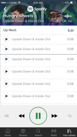
5. Allow the end user to quickly see and manage what music was coming up next.
6. Add animation to help drive engagement and direct attention.
7. Incorporate gesture navigation
Step 4: Prototypes
I then wired up the design for prototyping. Doing this would help validate that the new design concepts would be intuitive to another user and not just myself. Having these prototypes would allow me to test the layout, ux, and interaction models and validate the new design direction.
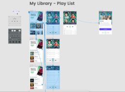
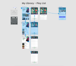
Clickable Prototype
Click anywhere on the screen below to experience the clickable prototype.
Step 5: Add Animation to enhance the experience
To put some final polish on the concepts, and to help communicate how gesture navigation would be incorporated, I then added some animation to the UI.
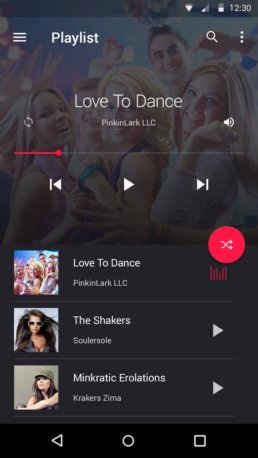
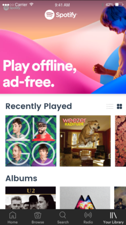
Final Design Concepts


Spotify – Let’s make this happen!
Spotify Mobile App Redesign
ServicesUI / UX, CASE STUDYYear2017